


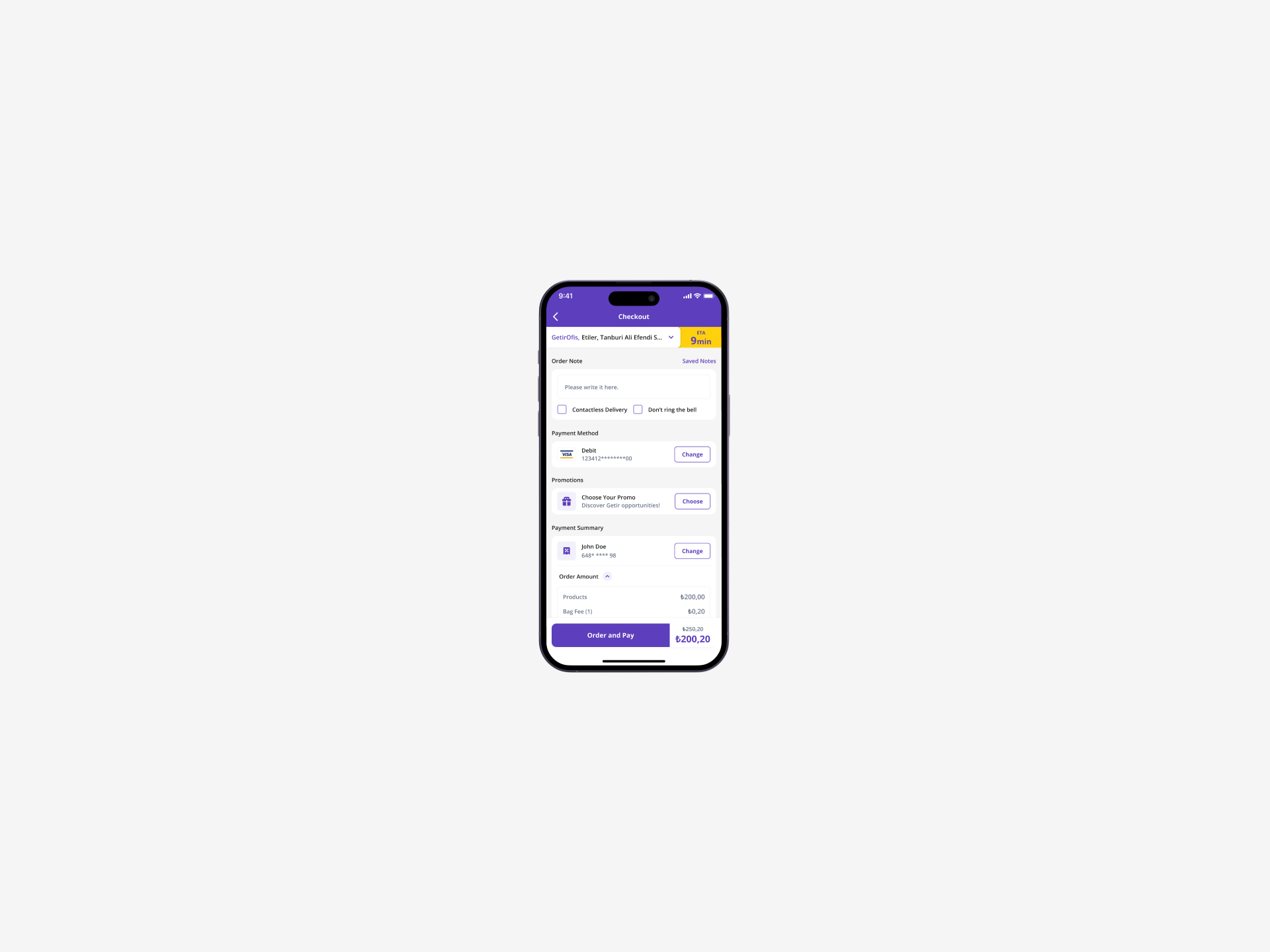
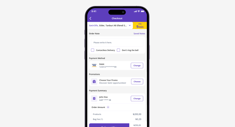
Getir's Checkout
Getir
Senior Product Designer II
5 Aug 2024
Abdullah Aydeniz
Project overview
This project involved a complete overhaul of the Getir checkout page. The initiative focused on three core pillars: enhancing user interface (UI) clarity, improving technical architecture, and modernizing the visual design
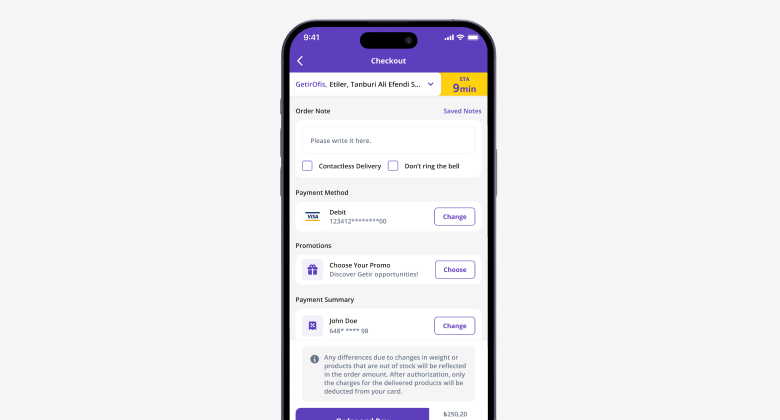
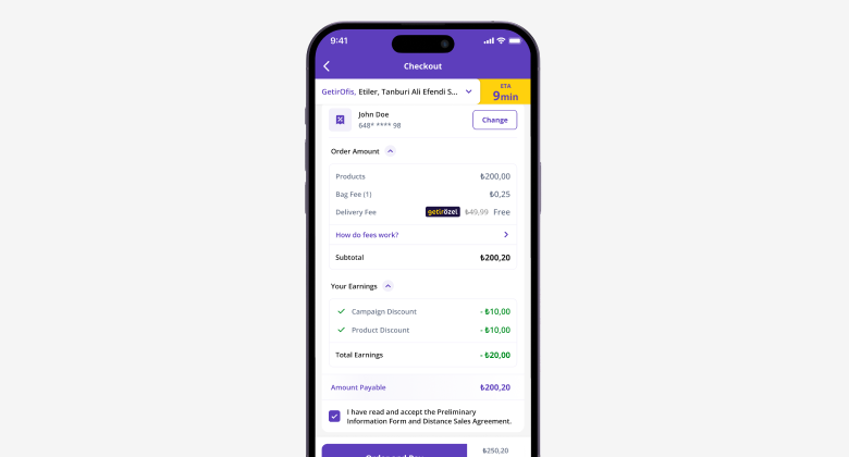
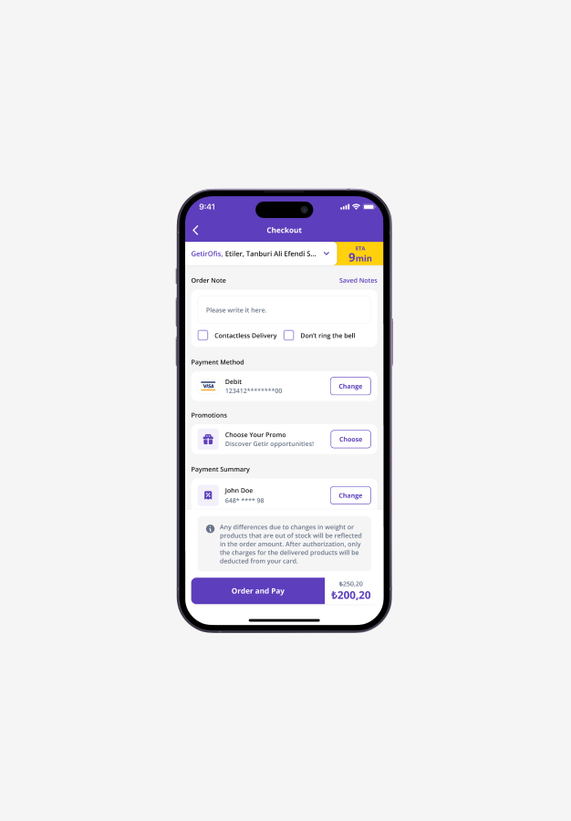
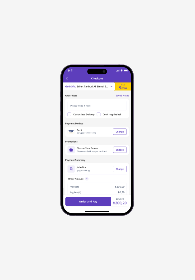
The key change was introducing clear, contextual information about Getir's provision charge for weighted items. The page was also rebuilt using Getir's new design system and engineered as a cross-domain component to ensure consistency and simplify maintenance across all platforms.
Problem
The previous checkout page created significant user confusion and operational strain, primarily due to a lack of transparency around the provision charge. This 5% pre-authorization, applied specifically to weighable items like fresh fruits and vegetables, was not clearly explained to the user at the point of payment.
This led to several critical issues:
- User Confusion and Mistrust:
Customers would see a higher initial charge on their payment method than their order total, only to have a portion refunded later after the courier weighed the items. Without an explanation, this process appeared as an error or an unexplained overcharge, eroding user trust.
- High Customer Support Volume:
The confusion directly resulted in a high volume of customer support inquiries. The support team was inundated with calls and messages from customers asking why they were charged more than their order total.
- Operational Inefficiency:
This constant stream of repetitive inquiries placed a significant operational load on the support team, diverting their resources from handling more complex customer issues.
- Inconsistent Experience:
The checkout page lacked a unified design and was managed separately across different Getir domains, leading to potential inconsistencies and a heavier maintenance workload for development teams.
Goal
The project was driven by a clear set of goals aimed at resolving both
user-facing and internal challenges.
The project's objectives were to:
01. Increase Transparency
Clearly communicate the purpose of the provision charge, explaining why it's necessary for variable-weight items and informing the user about the potential for a partial refund.02. Reduce Customer Support Load
Drastically decrease the number of support calls and tickets related to checkout and provision fee confusion.03. Modernize and Unify the User Experience
Implement Getir's new design system to create a visually appealing, intuitive, and consistent UI.04. Improve Technical Scalability and Maintenance
Re-architect the checkout as a single, cross-domain page to centralize control, ensure consistency, and make future updates easier to deploy.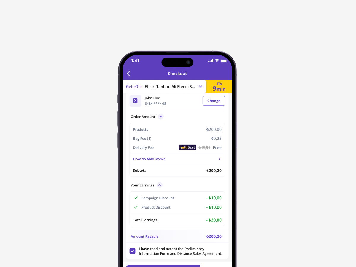
Outcome
The implementation of the new checkout page yielded immediate and dramatic results, successfully addressing all the project's goals.
The project's primary success metric was the 92.7% reduction in support calls related to provision charges and general checkout problems. The new, clear explanation on the page effectively preempted user confusion.
By demystifying the provision charge, the new checkout process became a transparent and predictable experience. This clarity rebuilt user trust and significantly improved the overall customer journey.
The massive decrease in call volume freed up the customer support team, allowing them to focus on more complex user issues and improving the support team's overall effectiveness and morale.
The move to a centralized, cross-domain checkout page using the new design system has streamlined development. It ensures every Getir user has the same high-quality experience and makes the platform easier to manage and scale.